
Creating a shimmer effect on a masked image with CSS
For an A.I. project I was looking to add some nice touches to the UI. The product in question was a virtual clothe replacement tool, that worked using Stable Diffusion inpainting.
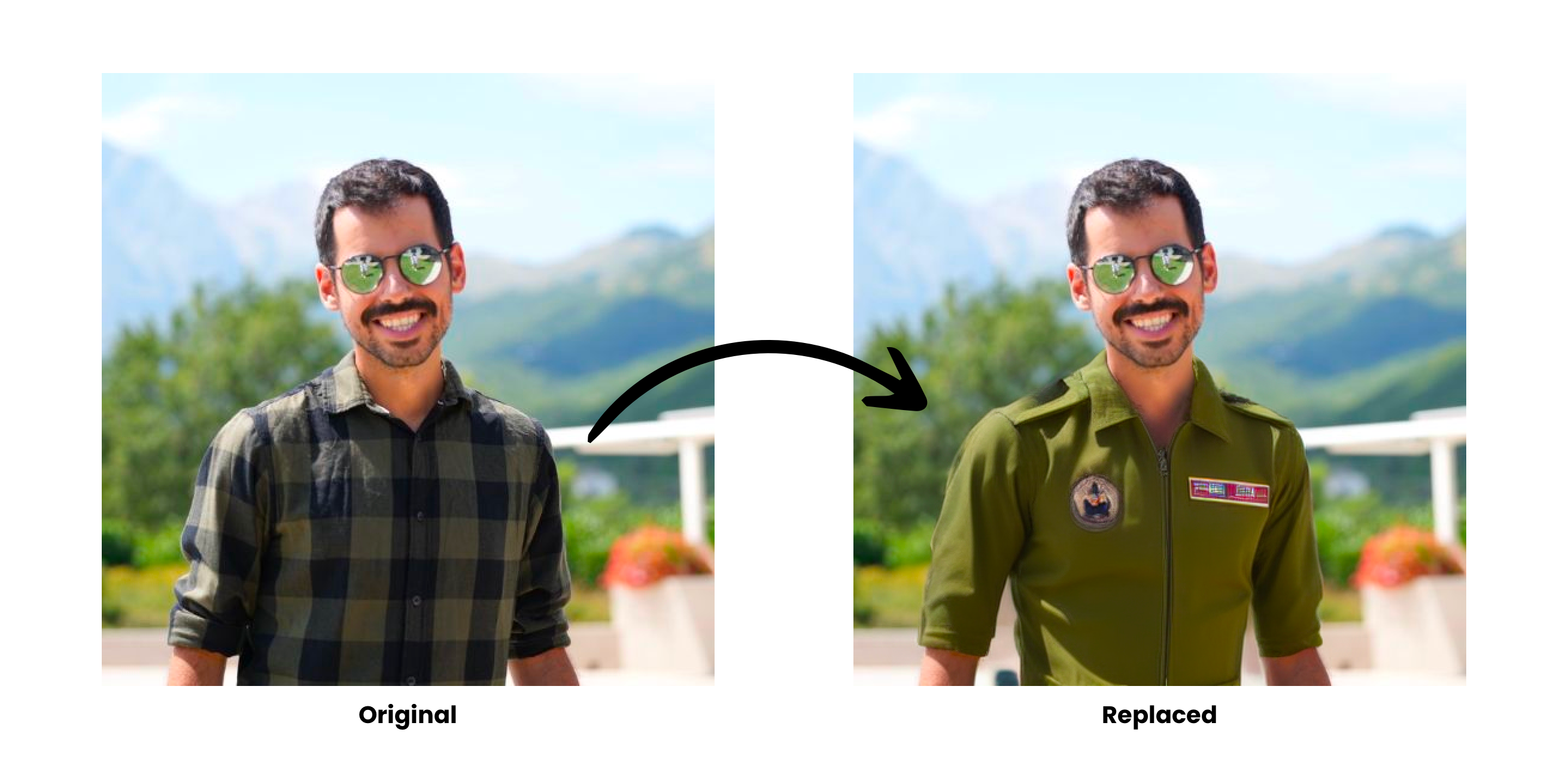
Using the initial version of Wardrobe AI you could upload an image, and using som A.I. magic the garments could be replaced.
This worked by chaining 3 processes:
- Detect garments
- Remove background
- Inpaint with Stable Diffusion
Today we'll focus on the nice shimmer effect we displayed while the A.I. was processing, as demonstrated below:
Building the shimmer
Our HTML consists of 3 parts:
<div class="contour-wrap">
<div class="contour"> </div>
<img src="https://i.imgur.com/ooOJJES.png" />
</div>- A wrapper, called
.contour-wrap - The contour called
.contour - And the image itself
.contour-wrap is mostly for positioning the example in the center on JSFiddle, and is a div with explicit dimensions set and centered using:
.contour-wrap {
    position: absolute;
    left: 50%;
    top: 50%;
    transform: translate(-50%, -50%);
}
.contour is an image with the background removed (eg. with rembg or commercial tools), like so:

Using CSS mask-image we can create our mask layer. By default the mask-image property will use the alpha channel, but you can control this using the mask-mode property. For our example using the alpha channel is perfect.
.contour {
    /* Positioning */
    position: absolute;
    top: 0;
    left: 0;
    height: 100%;
    width: 100%;
    overflow: hidden;
    z-index: 999;

    /* Mask properties */
    -webkit-mask-repeat: no-repeat;
    -webkit-mask-size: cover;
    mask-repeat: no-repeat;
    mask-size: cover;

    /* Replace {URL} with the actual URL */
    -webkit-mask-image: {URL}
    mask-image: {URL}
}
Creating the shimmer animation
Using the .contour:before pseudo element, we'll be creating the actual shimmer and we'll apply a keyframe animation on it.
The shimmer itself consists of some gradient magic rotated at a -45deg angle.
.contour:before {
    content: "";
    z-index: 10;
    position: absolute;
    height: 200%;
    width: 200%;
    top: -120%;
    left: -120%;
    background: linear-gradient(transparent 0%,
        rgba(255, 255, 255, 0.1) 45%,
        rgba(255, 255, 255, 0.5) 50%,
        rgba(255, 255, 255, 0.1) 55%,
        transparent 100%);
    transition: all 2s;
    transform: rotate(-45deg);
    animation: shine 2s infinite forwards;
}

@keyframes shine {
    0% {
        top: -120%;
        left: -120%;
    }
    100% {
        left:100%;
        top:100%;
    }

}
Without masking, the shimmer effect looks like this:
With the mask enabled, the effect looks like this:
Finally, we add our original image, and our shimmer effect is complete!
👋 If you enjoyed this content, feel free to sign up to my free newsletter, and follow me on Twitter.
No spam, no sharing to third party. Only you and me.